
Responsive Web Design & SEO: Here’s What You Need To Know
If Google jumped off a bridge, would you jump too? The answer, in terms of search engine optimization, is yes. For those of you unfamiliar with the dark arts of search engine optimization, or SEO for short, it is the process in which a website is systematically tuned to most efficiently match the criteria that the algorithms Google, Bing, and other search engines use to determine the relevance of your website to keywords in user searches. This is how search engines determine the display rank for websites based on each search query; and they have endorsed Responsive Web Design as the best way to make sure your website is king of the keywords. So then what are the SEO benefits of responsive web design? In this article, we will explore this topic in detail.
What is a responsive web design?
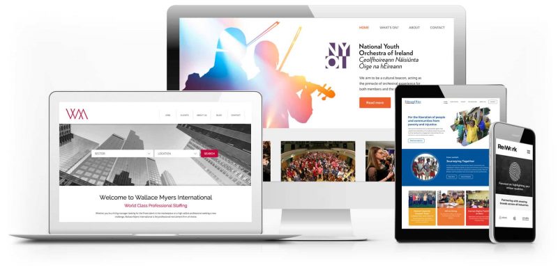
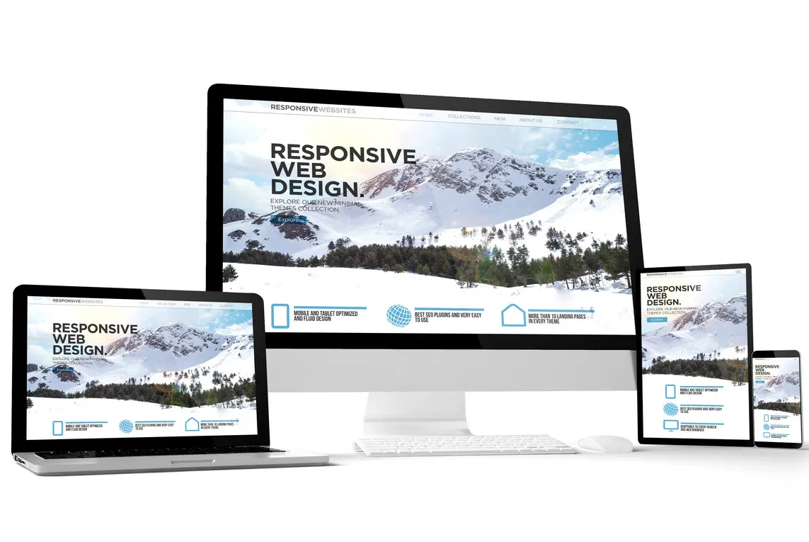
Responsive web design is an approach to web design that places User Experience (UX) at the forefront of importance. A responsive web design will adapt to the screen size, device and orientation of each user, creating an optimal UX for desktops, tablets and smartphones. A responsive website does not represent a new technology, rather it represents a new approach to existing technologies. A responsive website is built using a responsive framework, such as Bootstrap and Foundation.
The anatomy of a responsive web design can be broken down into 3 components:

Fluid-base proportion grids.
A fluid grid layout determines how the website will be displayed on different screen sizes and devices.
Responsive images.
Whereas traditional websites use images that are based on pixels and therefore fixed height and width, a responsive website use images based on percentiles. This allows the image to adjust itself depending on screen size.
CSS media queries.
A media query is a CSS module that allows content to render based on screen size. Media queries will match the type of device that is requesting the content and the corresponding style sheet will be applied to display the website.
What does responsive web design have to do with SEO?

I’ll start with a little background, since this is such a hot, albeit confusing, topic. Originally, these algorithms were not intended to be catered to. However, enterprising individuals discovered the potential that search engine optimization held, and began to wield this power for great evil. The world of SEO fell into darkness…until recently. Thankfully for those of us who hate our results being populated by irrelevant advertisement websites, Google and other search engines have begun taking a very active role in cleaning up their results. They are carefully monitoring SEO practices to make sure only the most relevant and useful information is displayed.
All the cheap tricks, (link farming, keyword spamming, cloaking, etc.) that were being used to circumvent the original purpose of the search engine (locating useful and relevant content), have been debunked. The websites who succumbed to the cheap thrills of the dark side of SEO have lost their ill-gotten ranking, and all the capital their marketing team had invested in it.
These changes have ushered in the dawn of the Golden Age for legitimate search engine optimization. Google and Bing have begun defining best practices and distributing recommendations and guidelines to help aid us in our goals to develop proper SEO while building the best websites in the world; and it all begins with the foundation. This is where responsive web design and its benefits for SEO comes in.
Top 10 SEO benefits of responsive web design.
In 2020, it’s shocking to consider that almost 60% of all websites still do not use responsive web design. In addition to the poor user experience this creates for users on mobile devices, this has a negative impact on your organic search engine placement. A responsive website has become a critical factor in SEO.
Here’s how:
1. Mobile device-friendly.
The fundamental benefit of responsive web design is that it provides an optimal experience regardless of the device or screen size the user happens to be on. A responsive website will adapt itself accordingly. By being mobile device-friendly, responsive web design makes life easier for search engines to index your website on any device..
2. Improved performance.
A responsive website is a fast website. The very approach to creating responsive web design is compliant with all modern web standards, including the W3C and ADA, which endorse the use of emerging web technologies. By following their recommendations, you are ensuring that your website will be optimized for speed and cross-browser compatibility for users on different devices. With minimized code, Google can serve your web pages much more quickly.
3. Lower bounce rates.
Google analyzes your bounce rate – the percentage of site visitors that come to your website and leave after just one page – and in part determines your website quality score depending on this statistic. A high bounce rate will lead to lower SEO and less traffic whereas a lower bounce rate will be rewarded accordingly. By having a responsive web design, you are ensuring that users across all screen sizes and devices will have an optimal experience. This will lead to them spending more time on your site and viewing multiple pages. This shite matters.
4. Improved user experience.
We know how important responsive web design is for mobile users, but how does it improve user experience? Simple. A responsive web design will improve organic SEO rankings and attract more site visitors. By choosing to have a responsive web design instead of multiple domains, you are providing content that adapts itself to the device the user is on. This provides for intuitive navigation of the website and a clean, attractive interface, effectively elevating the user experience to the next level.
5. Cost-effectiveness.
With responsive web design, you get to enjoy significant cost savings by not having to create two separate websites (one for desktop, one for mobile). In addition, the improvements you will see with SEO will allow you to decrease any dependency you may have on PPC advertising.
6. Backlink boost.
Backlinks are any external websites that provides a link back to your website. This is an important factor in SEO as Google ranks websites in part by its popularity; the more backlinks a website has the more popular it must be, and the higher authority a website has that provides the backlink will increase your ranking even more.
When you have a website for both desktop and mobile, you have in actuality two domains (eg., mydomain.com, mobile.mydomain.com). This confuses Google and causes search bots to split your backlinks, diluting the value for both domains. With responsive web design, your backlinks will connect with a single domain, boosting your popularity and search results.
7. Duplicate content avoidance.
Prior to responsive web design, web developers would create a scaled-down and separate versions of a website designed specifically for mobile devices. These are known as “mobile-friendly” websites. In addition to the increased cost in creating both websites, they created a colossal problem with search engines because in creating two websites you will have to use the same content twice. This is known as duplicate content and can reap havoc on SEO and organic placements.
Do not believe that your website is too small to be noticed – Google robots will index every page of both website and their algorithms will identify the duplicate content. By going with responsive web design, this SEO concern is completely eliminated as all of the content for both desktop and mobile resides on a single domain.
8. Social media.
Social media platforms are used by over 3.8 billion people. This represents half the world’s population and where you will most likely find customers spending countless idle hours. The benefits of responsive web design on social media is that that they provide seamless experiences on mobile devices, which constitute the majority of social media consumption on the web. In addition to this mobile benefits, social media juggernauts like Facebook and Twitter rank by Google as some of the most trusted sites on the web, giving your website top-tier quality backlinks.
9. Google’s Algorithm.
Google has tapped responsive web design as their preferred method for building a website and have made significant modifications to their search algorithms to support this and encourage web designers to follow suit. Google has chosen responsive web design for many reasons, but a few major ones include:
- A single URL is easier for users to interact with, share, and link to
- Single URLs are much easier for search engine algorithms to process
- A singular source of HTML makes crawling the website much easier, and avoids the need to reconcile findings from different bots searching multiple HTML sources
- Content is contained in one source, enhancing keyword saturation without filler, and allowing search engines to index the content more efficiently and accurately
But what does it all mean? Basically, the easier it is for search engines to read, analyze, and index the content on your website, the more precisely and confidently they can display that website with a high ranking when a consumer searches their engine using a related keyword.
Conclusion. Responsive web design and SEO.

All in all, SEO will still remain a moving target, and not everyone will follow the new rules, but any organization who wants to protect their web investments should do their homework when developing their SEO strategies. The major search engines have laid out their preferences for building effective long-term search optimization, and it begins with flawlessly executed responsive web design.
If you are interested in working with us regarding responsive web design, then connect with us today and get access to testimonials from our previous clients so that you can be assured of the quality of our work. When you get in touch, we will listen closely to help develop your goals into achievable results. Everyone on our team is looking forward to bringing your project to life, so get in touch today and organize an initial discussion.
To schedule your own complimentary responsive web design consultation, call us at 888.938.8289 or email us at inquiry@deepblue.com.
D E E P B L U E Knows the Market

D E E P B L U E is a San Francisco web designer that delivers measurable results. Learn more about our web design services and contact us to schedule a complimentary needs-assessment consultation.
When it comes to these hot new trends, the team here at D E E P B L U E is ready and willing to use them when designing your site. In fact, many of the new trends follow the work we have completed, making us proud web design trendsetters. If you want to get your hands on a site that is innovative and designed beautifully then give us a call, we’d love to work with you.
D E E P B L U E is recognized as a Top Content Marketing Agency by DesignRush.
