
Responsive Web Design Celebrates 10 Years Of Transforming The World
What was once a novel concept in the early days of the mobile web emergence, Responsive Web Design has become a gold standard in UX/UI design and website development. Responsive Web Design has transformed the entire world wide web from a land-locked and wired monolith to an immersive mobile experience that follows us everywhere we go. Today, we celebrate Responsive Web Design and look back on its impact over the past 10 years.
What is Responsive Web Design?

A responsive website is an approach to web design that places User Experience (UX) at the forefront of importance. A responsive website will adapt to the screen size, device and orientation of each user, creating an optimal UX for desktops, tablets and smartphones. A responsive website does not represent a new technology, rather it represents a new approach to existing technologies. A responsive website is built using a responsive framework, such as Bootstrap and Foundation.
The anatomy of a responsive website can be broken down into 3 components:

Fluid-base proportion grids.
A fluid grid layout determines how the website will be displayed on different screen sizes and devices.
Responsive images.
Whereas traditional websites use images that are based on pixels and therefore fixed height and width, a responsive website use images based on percentiles. This allows the image to adjust itself depending on screen size.
CSS media queries.
A media query is a CSS module that allows content to render based on screen size. Media queries will match the type of device that is requesting the content and the corresponding style sheet will be applied to display the website.
Origins of the Mobile Web
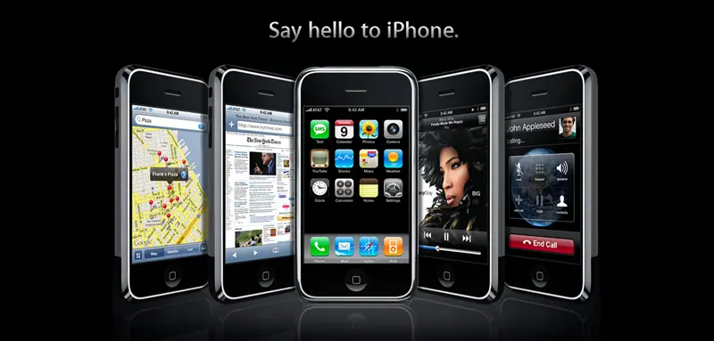
Responsive Web Design entered into the lexicon of the web development community right at the time when Apple released its first-generation iPad and four years after the introduction of the iPhone. These devices were game-changers, not just in the way we communicate, how we navigate, how we interface, or how we accessorize, but in how we perceive the very nature of accessing information. The Web, as we knew it, experienced a sudden death. The ball-and-chain that we associate with the traditional PC/desk interface became as antiquated a notion as a television without DVR. The Internet broke from its tethered bondage.
I am what you would call a serial early adopter. I was introduced to mobile browsing by my first “smart phone”, Motorola’s V200 Personal Communicator, which in 2002 was named Editor’s Choice by PC Magazine. Yes, it was a phone. Yes, it could send and receive text messages. Yes, it could handle email. And, YES, it could access the Net in limited fashion. My anticipation was that my long-sought dream of a mobile web would soon be realized. However, with its 2G speed, its tiny, monochrome, non-tactile display and text-only browser, the overall experience was less than nirvana. Today, my V200 sits in my drawer of misfit technologies, products that were perhaps a bit ahead of their time but failed to provide the killer app. My drawer is full of phones.

Motorola described that its new technological marvel “combines advanced messaging and calling capabilities in a stylish, compact unit”
With the introduction of smartphones, millions of people experience for the very first time a rich user-interface and seamless access to the web and all its bounty – websites, movies, music, news, etc.
But for many, the novelty of pulling up a website on a phone quickly lost its luster. These websites were designed for large monitors, using a keyboard and a mouse, and accessing them on a tiny device – no matter how high the resolution – left us frustrated and believing that there must be a better way.
As a stop-gap measure to address these concerns, web developers created alternative websites that were designed specifically for the dimensions and features of a mobile device. These “mobile-friendly” websites factored in size and usability to create page layouts that met user’s needs quickly, and displayed only essential information and made user input as simple as possible.
But problems quickly became apparent with these mobile-friendly websites. For starters, they were technically a separate website from the desktop version. This translated into additional development costs and duplication of effort as a mobile-friendly web build required the same process as its desktop big brother. Customers found that having two separate websites was extremely frustrating in that every time they updated/added a page or blog, or added events to their calendar they now had to do so twice. The final nail in the coffin for mobile-friendly websites was when we realized that Google was penalizing these websites as having duplicate content, an old trick used by Black Hat SEO and frowned upon by Google.
Responsive Web Design to the Rescue
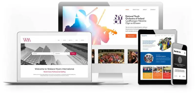
The concept of a responsive website is simple. A responsive website will adapt to the screen size and capabilities of mobile devices. For example, if you load a website on the web browser of a PC and a tab on an iPad or smartphone, the website will look just as sleek and users will be able to navigate the website seamlessly on any device. No need for two websites. A responsive website adapts its layout to best fit screen size and device. This was a huge step forward in creating rich user experiences on mobile devices that we all enjoy today.
Responsive websites quickly became a critical requirement due to the exponential trend in how we as a society began making web searches. Gone were the days when we would only sit at desks to search the web. Nowadays, almost everyone’s jeans – or hands – are equipped with a smartphone or tablet, making web searches convenient.
In fact, around 67% of all internet searches made today are done with a mobile device. This means your website needs to be responsive to cater to your intended market. If your website isn’t loading properly while they browse products on their lunch break, your competitors may be ready to swoop in.
How Has Responsive Web Design Transformed the World?

Responsive Web Design introduced a new approach to website development that was so simple, elegant and effective it was quickly adopted by the web industry as the gold standard in designing a website, and remains so to this today.
Oh, and did I mention that Google prioritizes responsive websites in their search results? Check out this article on 9 SEO Benefits of Responsive Web Design.
It is now 2020 and Responsive Web Design is celebrating its 10th birthday. If you own a business or manage a website and your site is not responsive you should be tarred and feathered.
Who Can You Trust to Get It Right?

DEEPBLUE is a Bay Area website design firm that specializes in creating responsive websites for businesses and organizations across different industries. We offer custom-built solutions for your business and make sure your website is fully responsive and fit for purpose.
We’ve been listed as one of the Best eCommerce Development Companies In The USA (That Are Up And Coming) by continually providing high-quality website design and development.
Contact our team now to arrange a free consultation!

