What Is A Responsive Website And What Are Its Benefits?
What is a responsive website? Before we begin to answer this question, let’s journey back to 1779. Legend holds that a youth by the name of Ed Ludd broke two stocking frames – mechanical knitting machines used in the textiles industry – in a fit of rage. Stocking frames represented the first major stage in the mechanization of the textile industry and played an important part in the early history of the Industrial Revolution. To Ed Ludd and others of like mind, these machines forewarned of a dangerous new world in which machines would replace English textile artisans through less-skilled, low-wage laborers, leaving them without work.
Thus, the Luddite movement was born.
In today’s usage, “Luddite” is a derogatory term describing anyone threatened by new technologies. Neo-Luddism is a viewpoint opposing many forms of modern technology; an inherent – perhaps misguided – belief that technology has a negative impact on individuals and communities. Because of this, Neo-Luddites are apprehensive about the ability of any new technology to solve current problems without creating more, potentially more dangerous, problems.
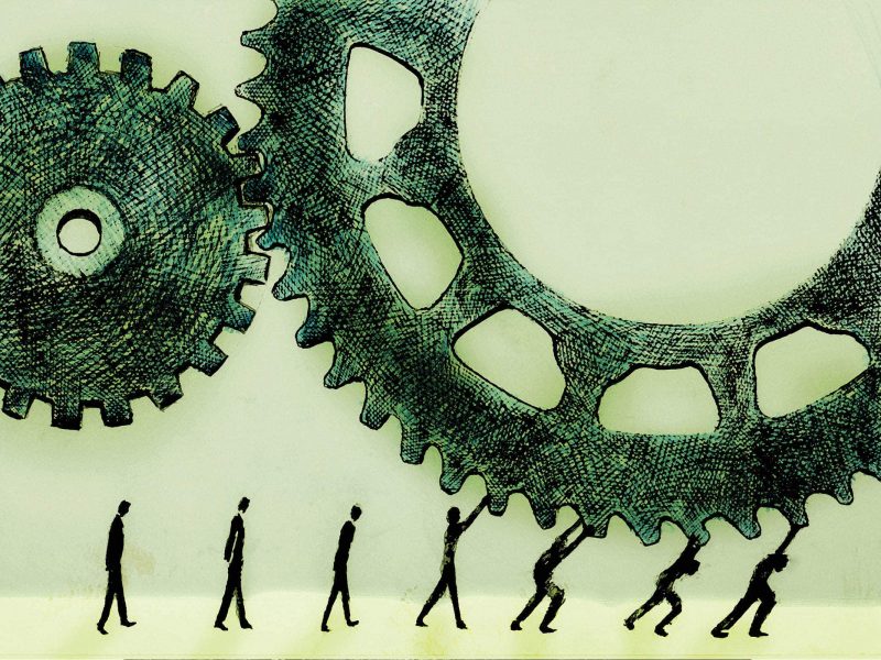
Technology Infiltration
During this era of technological proliferation across all facets of society and into our personal and professional lives, the luddite philosophy has manifested itself into a kind of sub-conscious, heuristic rejection of anything new. If it ain’t broke, don’t fix it – so they say. Although much of the trepidation with new technology can be attributed to the headaches and annoyance of actually having to use our minds to learn something, the intuitiveness and innovation in handling these emerging technologies makes this argument obsolete.
Slaying the Luddite
Responsive Web Design has emerged as a best practice in professional web design, and D E E P B L U E has been a thought leader in this approach as we delivered our first responsive website all the way back in 2013. As I have proclaimed on several occasions, Responsive web design represents an elegant solution to a complex problem. The approach allows developers to create a website from a single-data source and adjust its layout accordingly to provide an optimal viewing experience – easy reading and navigation across a wide range of devices (from desktop monitors to tablets and mobile phones). Responsive web design satisfies the user experience demands of today’s multi-platform consumer.
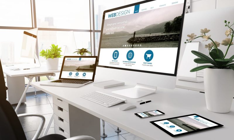
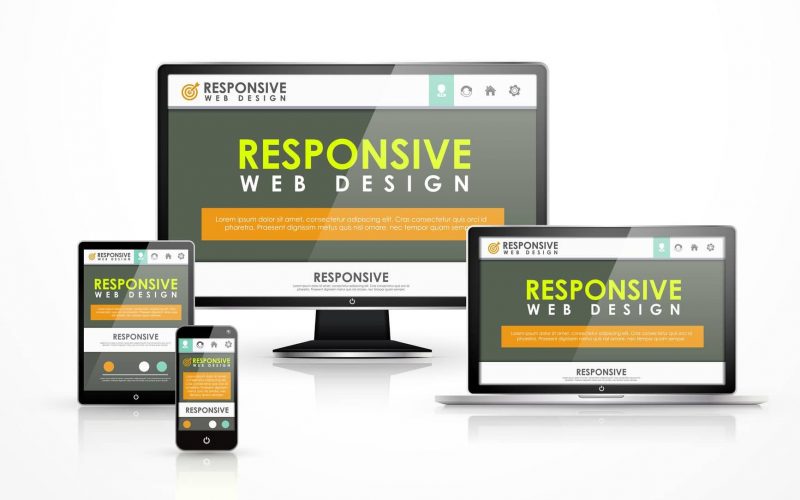
What is a responsive website?
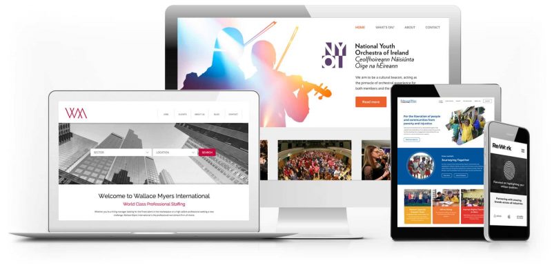
A responsive website is an approach to web design that places User Experience (UX) at the forefront of importance. A responsive website will adapt to the screen size, device and orientation of each user, creating an optimal UX for desktops, tablets and smartphones. A responsive website does not represent a new technology, rather it represents a new approach to existing technologies. A responsive website is built using a responsive framework, such as Bootstrap and Foundation.
The anatomy of a responsive website can be broken down into 3 components:
Fluid-base proportion grids.
A fluid grid layout determines how the website will be displayed on different screen sizes and devices.
Responsive images.
Whereas traditional websites use images that are based on pixels and therefore fixed height and width, a responsive website use images based on percentiles. This allows the image to adjust itself depending on screen size.
CSS media queries.
A media query is a CSS module that allows content to render based on screen size. Media queries will match the type of device that is requesting the content and the corresponding style sheet will be applied to display the website.
What is a responsive website?
Responsive web design and search engine optimization.
A responsive website responds to the specific environment of the user. The emergence of responsive web design has made the practice of developing separate, “mobile-friendly” versions of a website obsolete. In addition to a better overall user experience and less maintenance required, responsive websites are search engine-friendly. In recent articles, Google and Bing have tapped responsive web design as their preferred method for building a website that will be visited by any source of mobile traffic; which is any website that exists in today’s world. Google has chosen Responsive Web Design for many reasons, but a few major ones include:
- A single URL is easier for users to interact with, share, and link to
- Single URLs are much easier for search engine algorithms to process
- A singular source of HTML makes crawling the website much easier, and avoids the need to reconcile findings from different bots searching multiple HTML sources
- Content is contained in one source, enhancing keyword saturation without filler, and allowing search engines to index the content more efficiently and accurately
But what does it all mean? Basically, the easier it is for search engines to read, analyze, and index the content on your website, the more precisely and confidently they can display that website with a high ranking when a consumer searches their engine using a related keyword.
Conclusion

A responsive website is a critical requirement for a successful outcome with your website redesign. If you are interested in working with us regarding your responsive website design, then connect with us today and get access to testimonials from our previous clients so that you can be assured of the quality of our work. When you get in touch, we will listen closely to help develop your goals into achievable results. Everyone on our team is looking forward to bringing your project to life, so get in touch today and organize an initial discussion.
To schedule your own complimentary responsive website consultation, call us at 888.938.8289 or email us at inquiry@deepblue.com.
D E E P B L U E Knows the Market
D E E P B L U E is a San Francisco web designer that delivers measurable results. Learn more about our web design services and contact us to schedule a complimentary needs-assessment consultation.
When it comes to these hot new trends, the team here at D E E P B L U E is ready and willing to use them when designing your site. In fact, many of the new trends follow the work we have completed, making us proud web design trendsetters. If you want to get your hands on a site that is innovative and designed beautifully then give us a call, we’d love to work with you.